Project Overview
This case study outlines our work on branding the Coastal Action Network for the Environmental Defense Fund, focusing on enhancing its brand identity to better represent its environmental advocacy. Led by myself, Joshua Duttweiler, and Tyler Schultz, this project aimed to deliver a dynamic brand to enhance CAN's image and strengthen its appeal to key demographics and stakeholders.
Background
CAN, uniting seven community-based organizations, stands at the forefront of advocating for environmental justice in the Texas Coastal Bend. Faced with the daunting challenge of mitigating the detrimental effects of fossil fuels while promoting a transition to clean energy, CAN sought to reinvigorate its brand to better reflect its vision, values, and commitment to the well-being of Coastal Bend communities across present and future generations.

Strategy Phase: Research and Insights
The foundation of our branding strategy was built on detailed research aimed at uncovering the perceptions, attitudes, and behaviors surrounding climate change and environmental advocacy. Key findings indicated a widespread acknowledgment of climate change, particularly pronounced among Hispanic/Latino Americans, African Americans, Gen Z, and Millennials. This demographic was identified as not only highly engaged with environmental issues but also as the most impacted by them.
Armed with this knowledge, we outlined a strategy to craft a brand identity that would not only captivate and mobilize these key demographics but also appeal to decision-makers and industry leaders, creating a broad coalition for change.


Design Phase: Creating a New Visual and Verbal Identity
Logo Design and Branding Elements
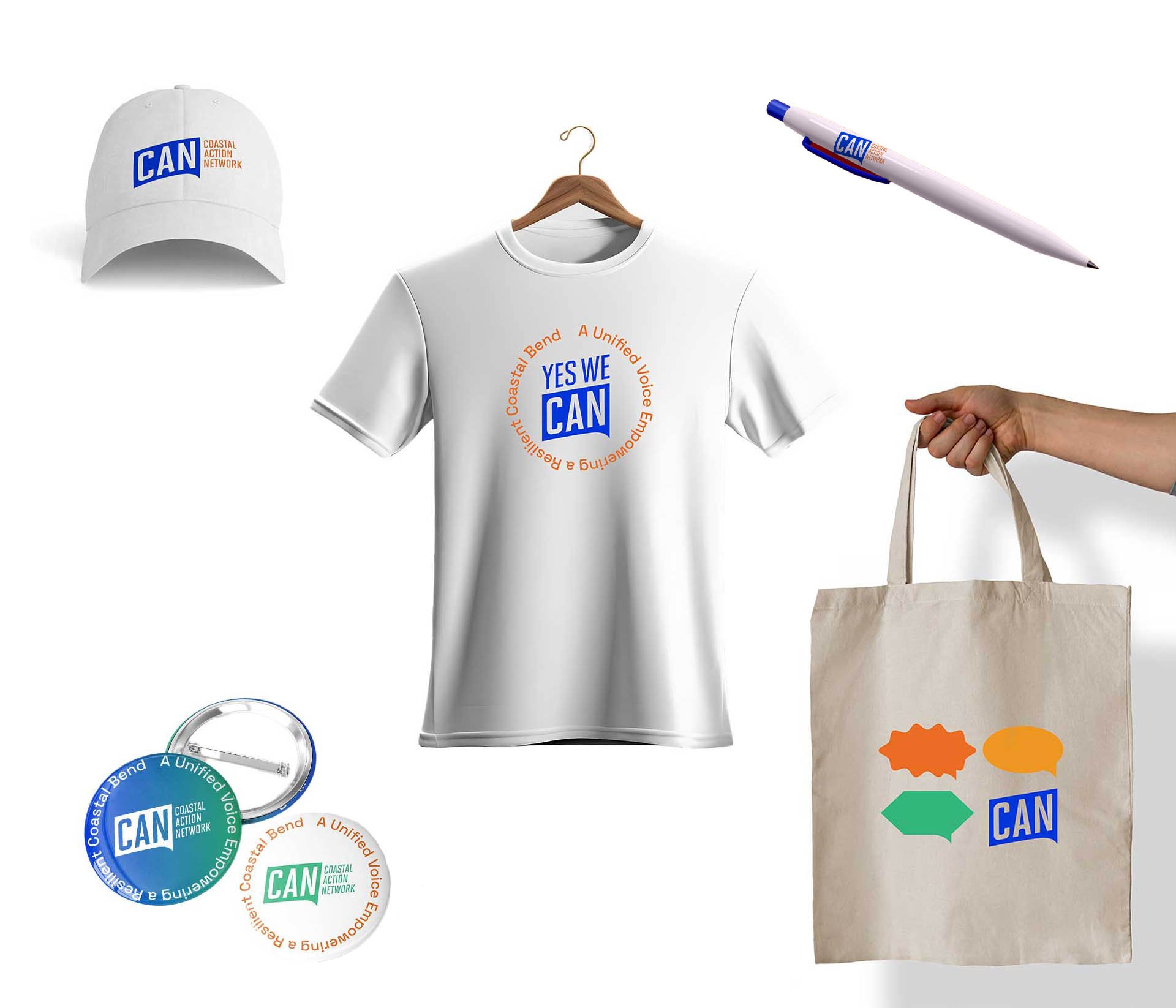
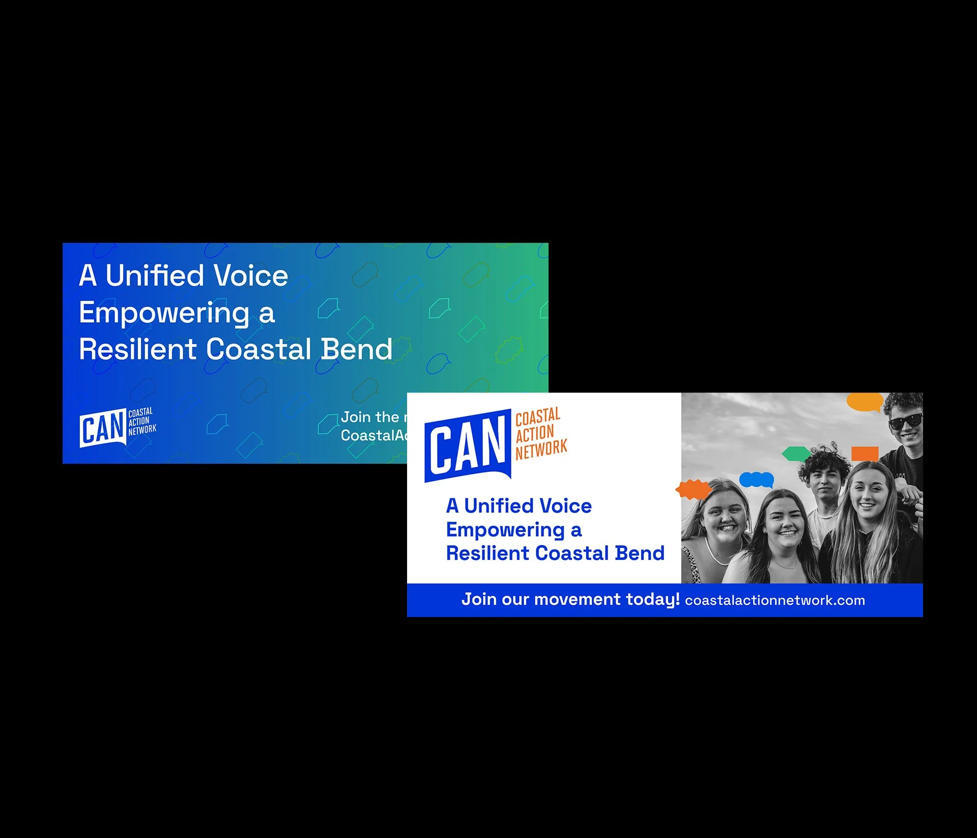
The centerpiece of CAN's new identity is a logo that encapsulates the essence of modernity, youth, and energy, reflecting the organization's proactive stance on environmental issues. This logo, combined with a carefully selected color palette inspired by the natural beauty of the Coastal Bend, serves to distinguish CAN within the crowded environmental sector.


Messaging and Tone
Our strategic messaging framework underscored solutions-oriented, fact-driven, and non-partisan narratives. By promoting a tone of optimism and empowerment, we aimed to galvanize community support and foster a collective belief in the possibility of meaningful environmental progress.

Typography and Brand Style Guide
To ensure consistency and clarity in all of CAN's communications, we introduced two primary typefaces: Space Grotesk for headings and Lato for body text. Our brand style guide meticulously detailed the applications of these typefaces, alongside guidelines for imagery that emphasizes the community's resilience and the environment's natural allure.
Implementation and Rollout
The rebranding extended across all facets of CAN's public-facing materials, from digital platforms like social media and the website to physical assets including environmental graphics, promotional materials, and event branding. Each element was infused with the new brand identity, ensuring a cohesive and impactful presentation.


Results
The rebranding significantly enhanced CAN's engagement with its audience and received positive feedback for aligning with its mission. This has strengthened CAN's position as a leader in environmental advocacy in the Coastal Bend.


Conclusion
The CAN branding demonstrates the impact of strategic branding in environmental advocacy, successfully developing CAN's image to reflect its mission and engage with its target audience.